New York City Transit Authority Graphics Standards Manual (Unimark International, 1970)
A 1970 standards manual for the New York City subway, produced by Unimark International, setting out the grid, colours, typeface, arrows and route bullets for every sign in the system.
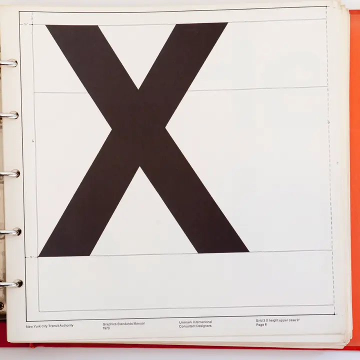
Unimark International produced this manual for the New York City Transit Authority, and the Authority published it in 1970. The subway it addresses had been built as three separate systems, and the signs showed it: tile mosaics, enamel plates and hand-painted lettering laid down by different people in different decades. The manual replaces that accumulation with a grid, a short list of colours, one typeface family and a fixed set of arrow and route-bullet shapes. For each of them it says where it belongs on a wall, a pillar or a turnstile.
Much of the binder is spacing and alignment: how far a bullet sits from the edge of a sign, how a station name is set against the arrow beside it. Those instructions are the point, because a system with hundreds of stations and many hands can only look like one thing if the small decisions are made once. Platforms were converted over a long stretch of years after publication, one renovation and one replaced sign at a time. A rider who follows a coloured circle to the right train is reading the result.
Provenance
- Original source
- https://archive.org/download/nycta-gs-manual/NYCTA%20GS%20Manual_text.pdf
- Collected
- This copy
- 14.6 MB · 182 pages · archived here
- Rights
- Rights belong to someone else. The copy here supports the commentary on this page, and comes down on request.
- SHA-256
586424b2ba9c996c9d2302c342e7c022bdc40e5578f75f2ff22662e1736725b7
Accession № 0066. If you hold rights in this and would rather the copy did not exist, say so and it comes down.