NASA Graphics Standards Manual (NHB 1430.2, January 1976)
The manual that introduced the NASA worm. Danne and Blackburn stripped the agency's identity down to four red letters and then specified, over dozens of pages, exactly how those letters were to sit on a launch vehicle, a business card, a parking sign and the tail of an aircraft. NASA abandoned it in 1992 and brought it back in 2020.
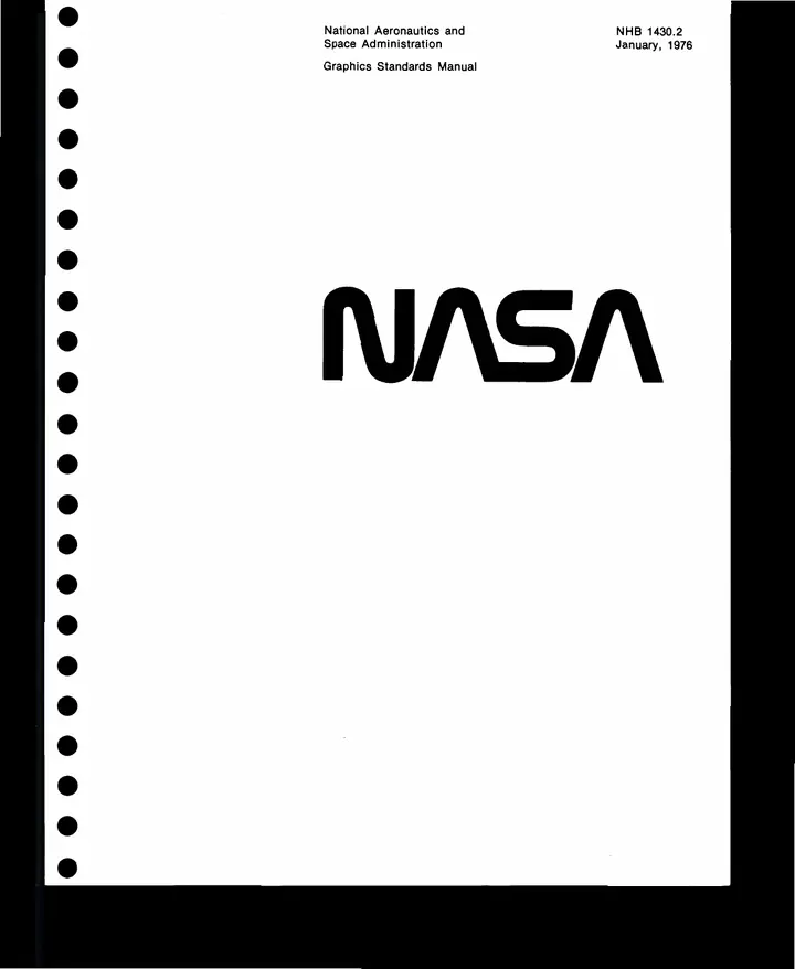
Danne and Blackburn were handed a federal agency with an inconsistent visual identity and returned four letters with the crossbars removed. NASA used the result from 1976 until 1992, when an administrator disliked it and restored the older insignia. The agency brought it back in 2020.
What the manual does is specify everything that follows from those four letters: the logotype's clear space, its behaviour on a launch vehicle, its size on a business card, its position on the tail of an aircraft, the exact red. Two designers made every decision once so that nobody else would have to make any of them again.
In 2015 two other designers ran a Kickstarter to reprint it, having already done the same for the New York City Transit Authority's manual of 1970. Both campaigns funded several times over, which is an unusual fate for a document written to be filed.
Provenance
- Original source
- https://www.nasa.gov/wp-content/uploads/2015/01/nasa_graphics_manual_nhb_1430-2_jan_1976.pdf
- Collected
- This copy
- 3.4 MB · 60 pages · archived here
- Rights
- Work of the US federal government, not subject to copyright (17 U.S.C. 105).
- SHA-256
2aebec98b6c21ae8868f56f9c3a19c6605bcdc302a050923234cced3d8a46b24
Accession № 0006. If you hold rights in this and would rather the copy did not exist, say so and it comes down.